Ever since the release of SNP & Variation Suite (SVS) 7.4 back in January, our software engineers have been hard at work developing new functionality for the next version, to enable researchers to have even more control over their data. (Okay, well really, they started working on it before 7.4 even came out.) While the full details of 7.5 are not yet available, I wanted to give our loyal blog followers a “sneak peek” at the filtering improvements that will let you quickly and easily visualize results in our plot viewer and genome browser as never before.
With SVS 7.5, users will be able to group and filter variables dynamically “on the fly” to look at multiple dimensions of specificity and perform quality assurance on their data. Because really, a chart with colors is much easier to interpret than a spreadsheet.
Please note that the functionality, screenshots, and tab/button names in this post are just a “sneak peek” and may change before hitting stands in 7.5.
Advanced Filtering
While users can currently filter in the genome browser, it is limited to one variable at a time. SVS 7.5 eliminates this constraint to empower visualization to the nth level.
Let’s say you want a Manhattan plot of all values over -log10 p-value of 3, with color coding by chromosome. To do this in 7.4, you would need to sort a spreadsheet of -log10 p-values, inactivate all the results under 3, re-run your plot, and then filter and split based on chromosome.
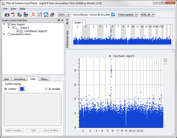
Not anymore. Simply create your plot and chose a couple of options in the Graph Control Interface to color by chromosome.
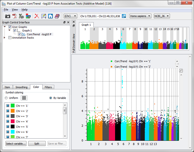
A second tab allows you to sub-set the data based on criteria, such as -log10 P > 3.
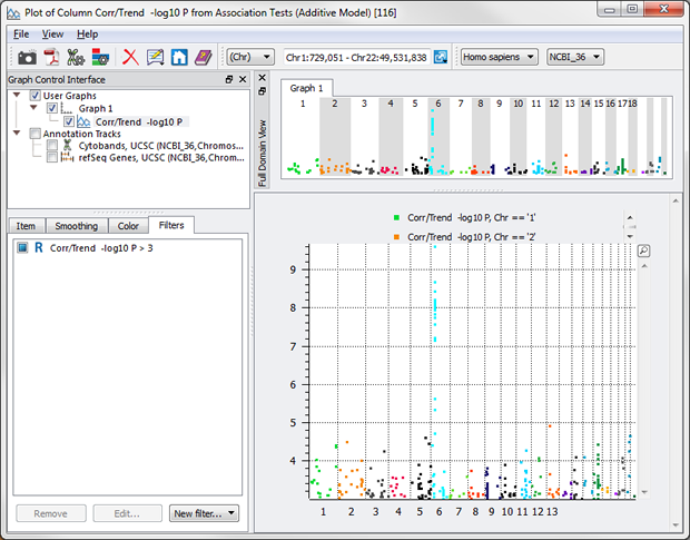
Voila – publication-ready Manhattan plot of -log10 p-values just over 3, colored by chromosome!
What about over 3, but under 4? Just add another filter.
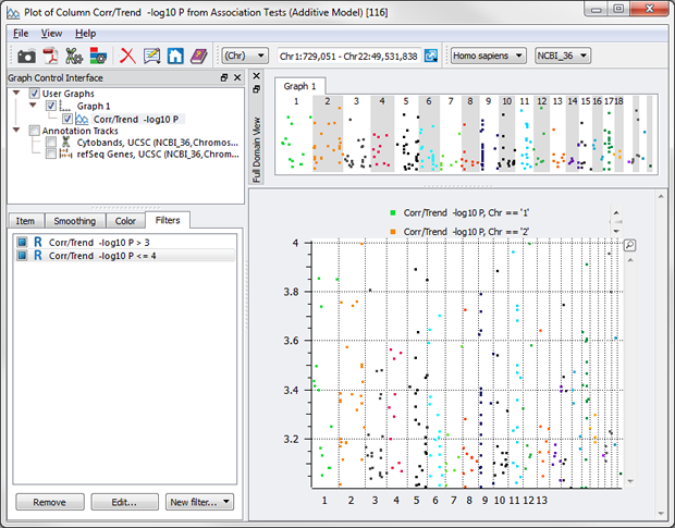
Even “or”s can be utilized now with the Syntactic option. Let’s say you want everything BUT the values between 3 and 4.
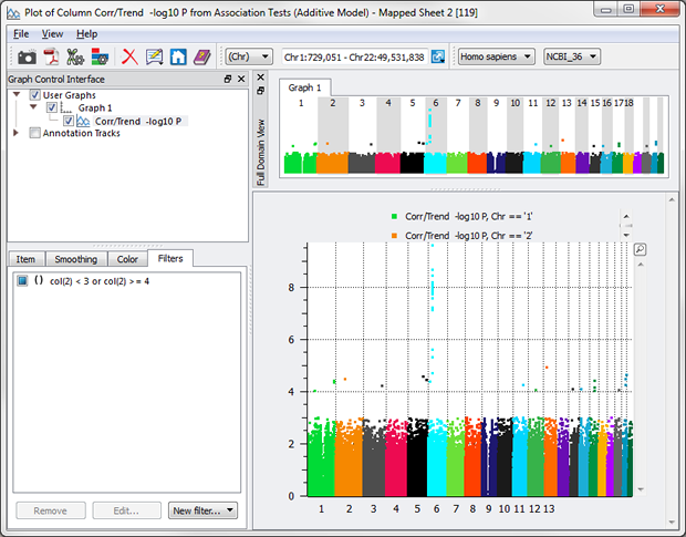
While this “or” example is simply for illustration purposes, “or”s can be powerful in examining your data nuances, e.g. wanting to see just the samples that have high blood pressure or smoke.
Being able to dynamically group and add filters lets the user see cross-sectional data visually without going back to a spreadsheet and creating a subset (or even multiple subsets for different variables – and then if you make a mistake or need more granularity, doing it all again!).
Group on a Heat Map
Historically, heat maps haven’t had any filter capabilities. SVS 7.5 will change that with the ability to group samples based on phenotypic or genotypic variables.
For example, check out this heat map of HapMap samples with binary ROH status for homozygous runs of length >= 1500kb with minimum of 25 SNPs:
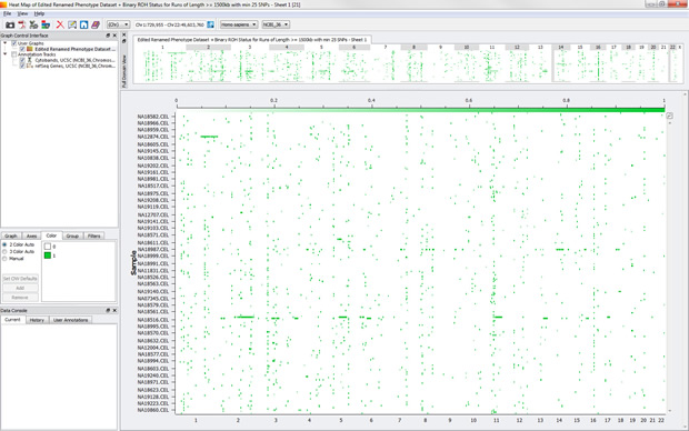
We can see a few samples with long runs of homozygosity and even a few ROHs that occur in across several samples.
While those might be some areas to investigate, take a look at what happens when we group by population.

The key at left shows that the blue band is European, the green is Chinese and Japanese, and the orange band is Yoruban. Now we can see that there are a lot less ROH segments across the genome for Yorubans than the other two populations.
Grouping and Filters in Combination
While grouping will allow you to dynamically change how the data is clustered, filters are what let you add multiple dimensions. So, there’s a fun little button called “Save as filter…” (name subject to change).
Let’s say I want to dig a bit deeper into the CEU population. Simply click on “Save as filter…” A filter is now created with Population = CEU and the grouping has cleared.

Now, you can group on something different, say Case/Control (just for Population = CEU).
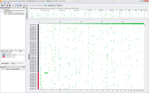
While there isn’t much difference in this dataset between cases and controls, that is still something good to know as you dive into your data!
(And this process of grouping, transferring to a filter, and re-grouping can be repeated as many times as you want to see even greater levels of detail.)
And More!
Splitting is also a cool feature that works just as it does in 7.4 – by clicking the Split button, new nodes are created (by “splitting” the graph into separate graphs based on the criteria you selected) under the Graph Control Interface, each of which can be manipulated individually. (For example, if you want your cases to be circle dots and your controls to be squares.)
Grouping, filtering, and splitting in SVS 7.5 will be available for variables in the genome browser, XY scatter plots, histograms, and heat maps. (Technically, filtering is also allowed for LD plots, but it’s a bit more complicated.)
The examples used here are very simple, but we expect that our brilliant customers will find lot of creative ways to use this feature!
So when will you be able to get your hands on it? Keep your eyes peeled in July. …And that’s my two SNPs.