Today, we will be exploring the indispensable role of GenomeBrowse in your VarSeq workflows. This blog aims to guide you through various customization options, including color preferences, filtering techniques, display modifications, numeric value plotting, and additional tips. I hope to enhance your GenomeBrowse experience and enable you to gain valuable insights into your data.
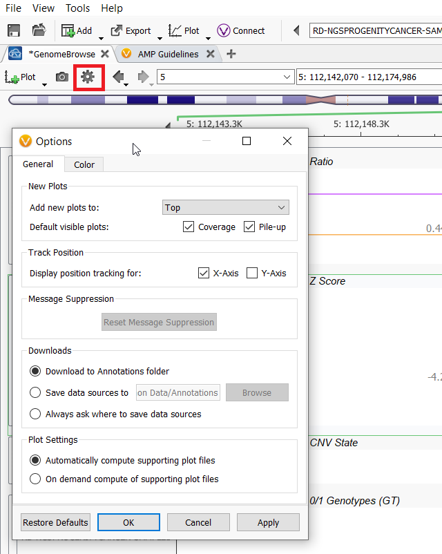
Let’s jump in by talking about the global GenomeBrowse settings and which customizations can come from this menu. Within the GenomeBrowse window, the gear icon in the top menu bar allows you to control global changes to GenomeBrowse, such as if plots are added to the top, which plots are shown by default, annotation download locations, how to compute supporting plot files, and color settings.
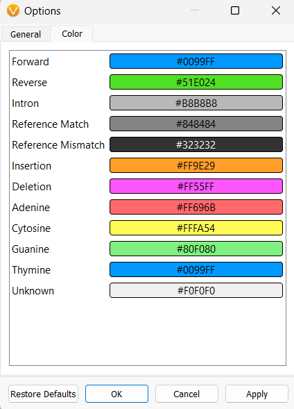
The Color tab allows you to change colors for any of the items that can be plotted within GenomeBrowse, such as the colors associated with nucleotides or insertions and deletions. This is not the only place to control the colors for the plots, but I will show these other color-customizing options a little bit later.
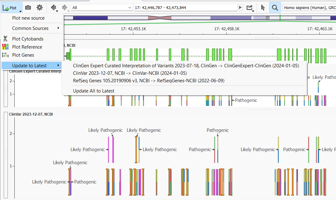
Before moving on to the individual plot customizations, the Add Plot Icon offers a little-known trick. The last option in the list is the Update to Latest button. This button will be clickable if you have plotted annotations that have a newer source available for download. This button is super helpful as you can update all of the out-of-date plotted annotations with one click. You can also imagine this button being very useful for updating project templates since the plotted annotation sources and their versions are saved into project templates.
The next set of customization options is for each plotted source individually. Each annotation plot can be customized by clicking on the small gear icon in the top left-hand corner of the plot, just above the features list.
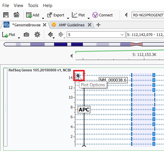
Once you click on the gear icon, a couple of different options become selectable: add a label or More Controls. In the ClinVar annotation example below, I chose Classification from the labels dropdown and then selected More Controls…, and then selected the Filter tab to filter the results shown in the plot to be only Likely Pathogenic and Pathogenic entries in ClinVar.
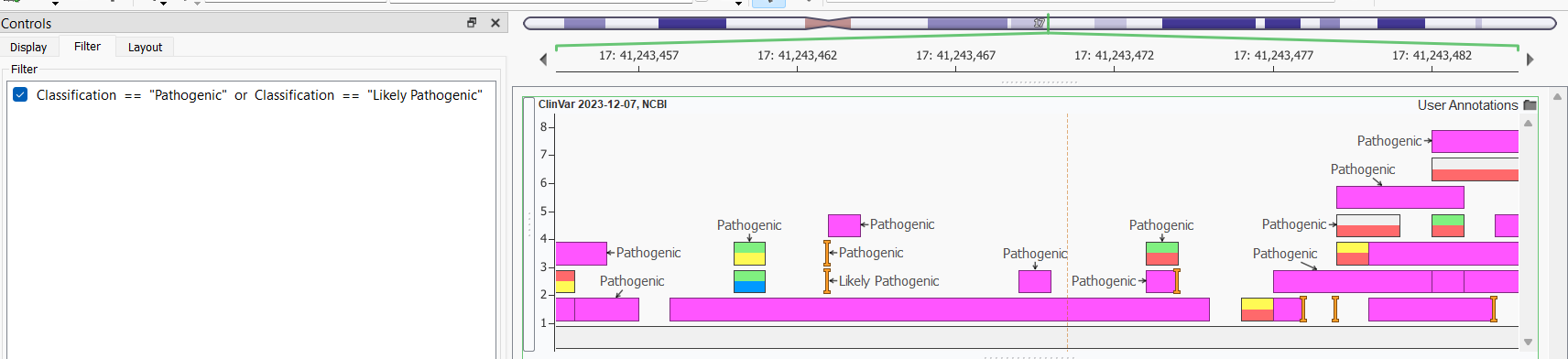
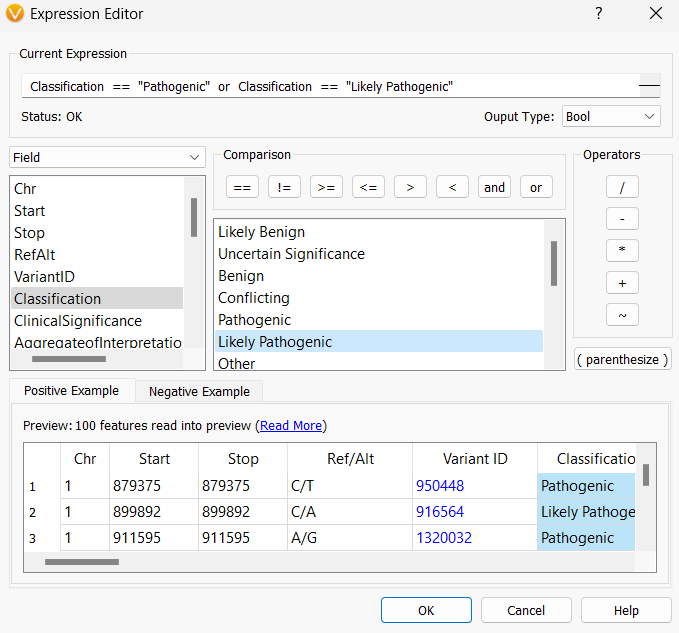
The Filter tab opens up the Expression Editor so you can set up logic to display certain records.
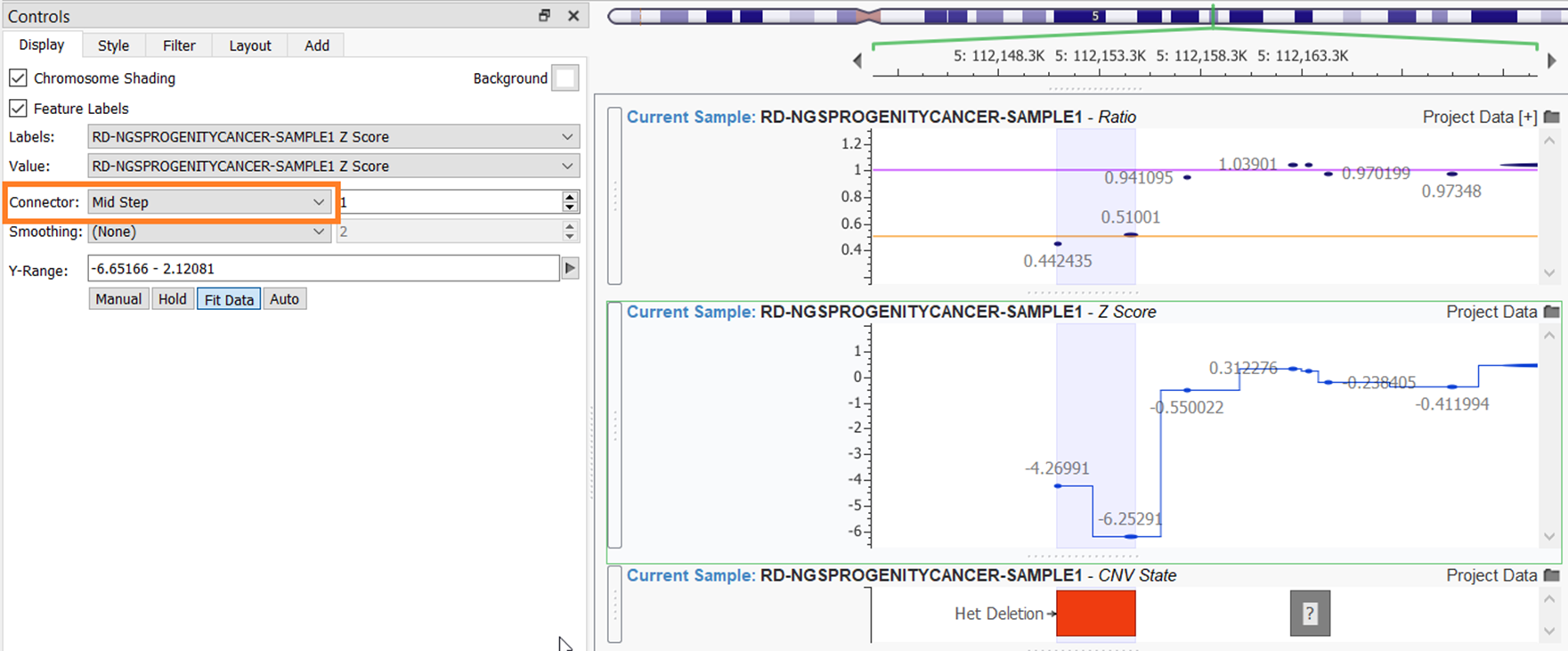
Remaining in the More Controls… menu, there are a few other tabs to explore. The additional controls can somewhat differ depending on the source. All sources will have a Display tab, which allows you to modify some color options, such as choosing a different background color or toggling on or off chromosome shading. The Display tab can also change the plots’ labels or modify the y-axis scale. Numerical plots, such as plotting CNV Ratio and CNV Z-score, have some additional options in the Display tab. In the example below, I have added a Connector Mid-Step line to the Z-Score plot to more easily see the dips and rises for the values.
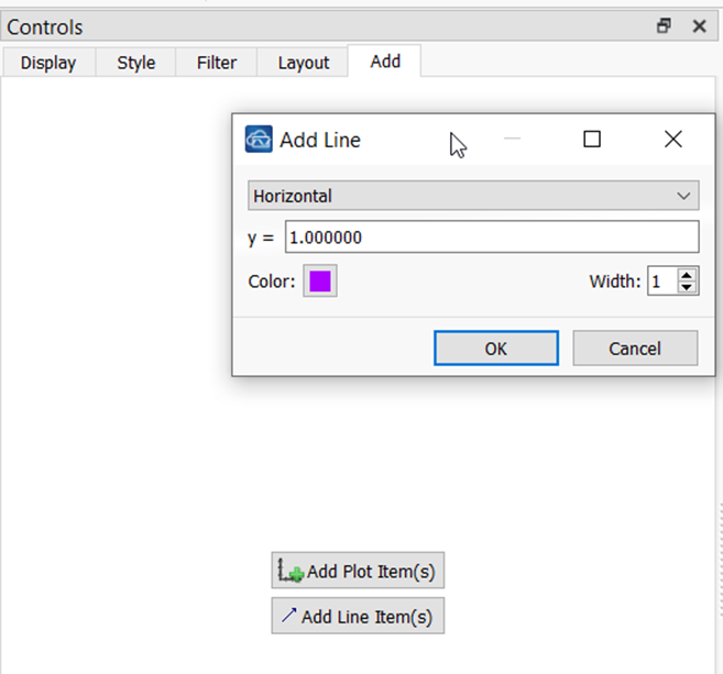
To the Ratio plot, I added 2 line items: one steady line at ratio values of 1.0 and another steady line at ratio values of 0.5. This requires navigating to the Add tab and choosing Add Line Item.
As I mentioned, each plot will have different options, so I encourage you to explore these tabs and tweak the settings to find the display that works best for you. A final quick tip is that you can save publication quality or report quality images from GenomeBrowse by clicking on the Camera Icon. As always, our amazing support team has great tips for customizing your GenomeBrowse as well, so feel free to reach out with questions to [email protected].