
In recent weeks, GenomeBrowse capabilities have had a sudden resurgence of interest among our customers. To support this, the FAS team wanted to share with you several under-utilized GenomeBrowse plotting tricks. First, let’s cover plotting a BED file for easy track viewing.
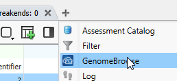
The first step is launching a GenomeBrowse window by clicking the + button and selecting GenomeBrowse (Figure 1).
Remember, you can always reorganize your project layout. For example, by pulling on the GenomeBrowse tab, you can reorder your view, or make GenomeBrowse its own window (Figure 2).
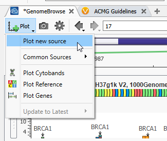
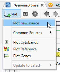
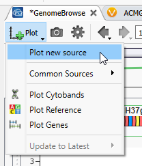
Now that GenomeBrowse is easy to view go to the Plot Button, and hit Plot a new source (Figure 3). You’ll see that there are options to plot some common sources here as well.
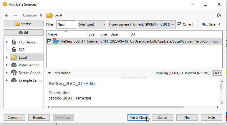
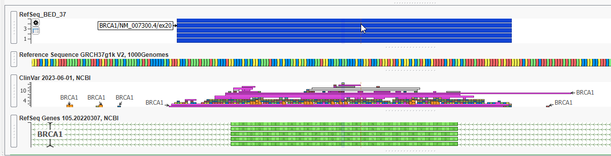
We are first going to plot the BED file used for calculating coverage statistics. You can quickly search by the name you gave your BED file. Here, I am searching for my file with the word ‘BED’, and now can plot that file (Figure 4).
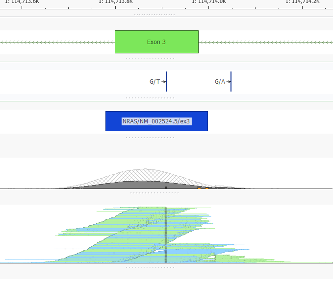
With this view, I can look for overlap of my BED track with the RefSeq defined Exon, or any other data source plotted, such as my BAM files to visually determine the read depth in those regions I calculated coverage over (Figure 5).
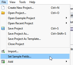
If you have not previously associated an alignment file (BAM or CRAM file), so to File > Set Sample Fields, and you will be able to associate those alignment files by defining the path to the BAMs or CRAMs for your samples (Figure 6).
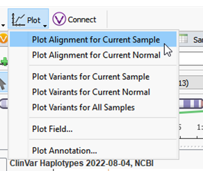
Now that the alignment file is associated, you can plot it by going to Plot > Plot Alignment for Current Sample (Figure 7).
Here I am viewing a BAM file, and you can see the coverage and pile-up for this region of MUC2 (Figure 8).
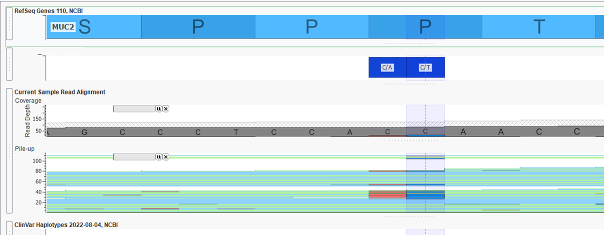
Paired with the BED file plotted above, it is easy to see the coverage region for my exon, as well as the boundaries we have defined to use with the coverage regions (Figure 9).
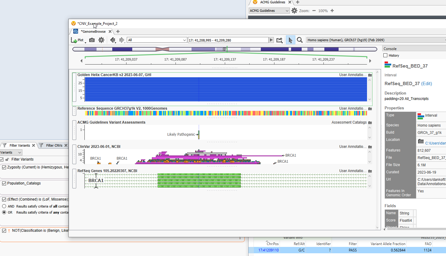
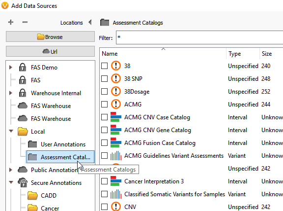
Next, lets take a look at plotting an assessment catalog. The assessment catalogs have a variety of uses, from keeping track of variants scored in VSClinical, to marking known sequencing artifacts to be filtered out of the project. Viewing an assessment catalog in GenomeBrowse can bring another dimension to your analysis. Go back to the plot button in GenomeBrowse (Figure 10).
At this point, you can select the drop-down option on your locally downloaded annotations to select the Assessment Catalog folder (Figure 11).
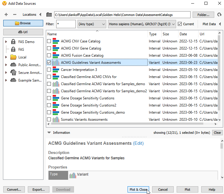
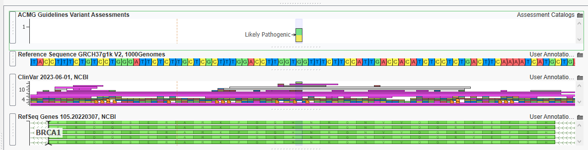
Here, we are going to select the ACMG Guidelines Variants Assessments and see if I have previously scored any variants in BRCA1 (Figure 12).
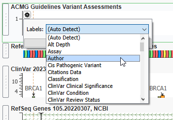
Now that the Assessment Catalog is plotted, I can hit the gear icon to determine the type of information plotted (Figure 13). Here I want to change it to Classification, but you could plot other fields like the author of the assessment, or the name of the sample with the variant.
Just like that, I can see that there is one Likely Pathogenic Variant that I have previously classified in BRCA1 (Figure 14).
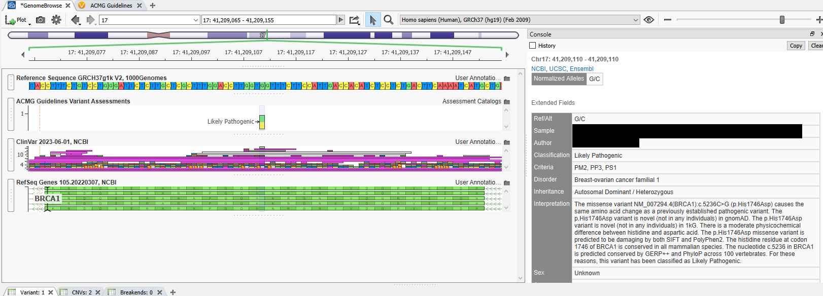
By clicking on that variant, I can view information such as the sample’s name, the author’s name, the classification, the criteria, and more (Figure 15).
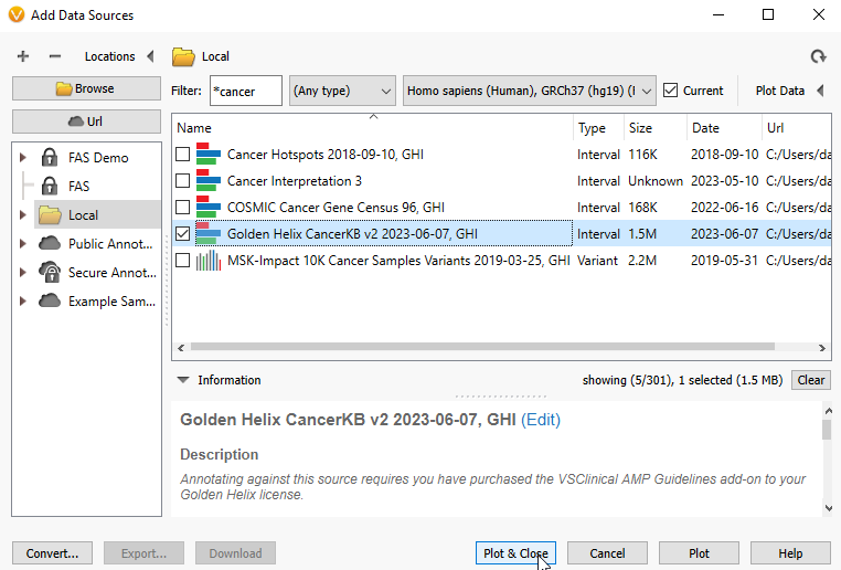
Now that I have pulled in information on my BRCA1 Likely Pathogenic variant, perhaps I want to see if there is any cancer-specific information about this location. To do this, I can plot Golden Helix CancerKB (Figure 16).
As before, select the annotation source of interest, hit plot, and close (Figure 17).
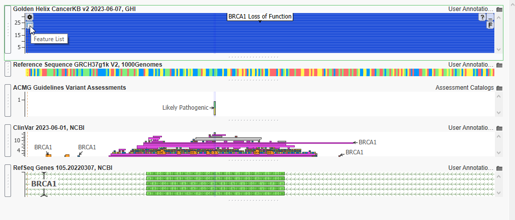
As you can see, there are multitudes of submissions for this BRCA1 location. Let’s plot the features list, so we can determine if any of the submissions are useful for this sample. Hit the Features List icon below the gear icon in the upper left-hand corner of the plot (Figure 18).
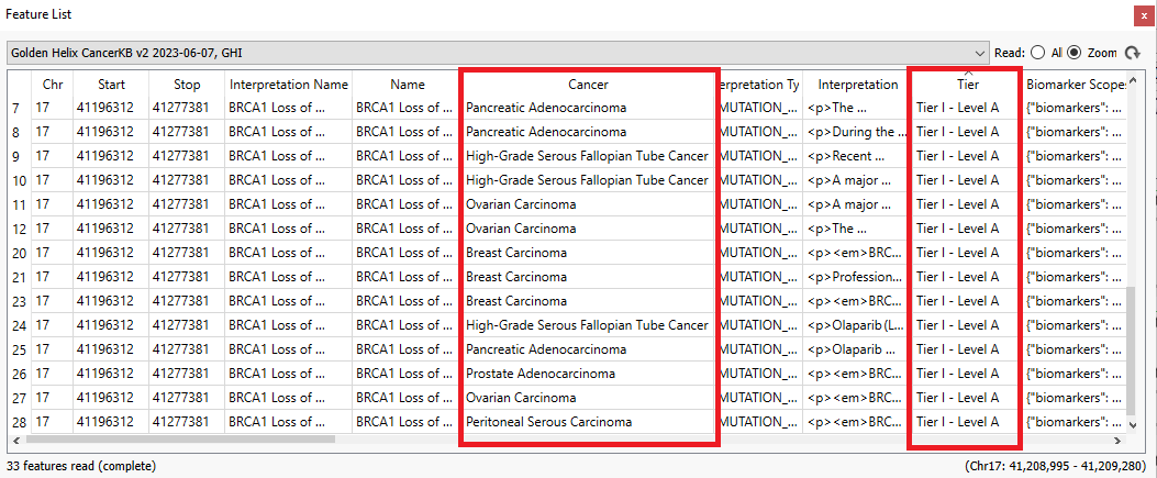
Examining the features list, I can look at the associated cancer type, the Tier Level for the marker, drugs, trials, and more (Figure 19)!
We hope that you can make use of these plotting tricks in your own workflows. Please reach out to support if you have any questions about how to use GenomeBrowse to complement your NGS analysis!