Population Stratification
This article is going to cover how to factor for population stratification in your association test to continue our blog series on top quality GWAS analysis (additional articles for this series are located at the bottom of this blog). Quality control steps up to this point have included assessing sample and marker statistics, LD pruning on markers, and investigating sample relatedness. Each one of these steps is critical, and accounting for population structure is no exception. Since GWAS involve large samples sizes to detect small effects and thousands of SNPs, even small artifactual differences in allele frequencies between cases/controls can generate false positive results. One
Shown in Figure 1, accessing PCA is done by clicking on Genotype from the sample+genotype spreadsheet. Select to compute the principle components, desired output, marker normalization, and genetic model (Figure 2). For more details on PCA setup click here.

Fig 1. Accessing the Principle Component Analysis tool from the genotype spreadsheet.

Fig 2. Selecting option from the PCA menu.
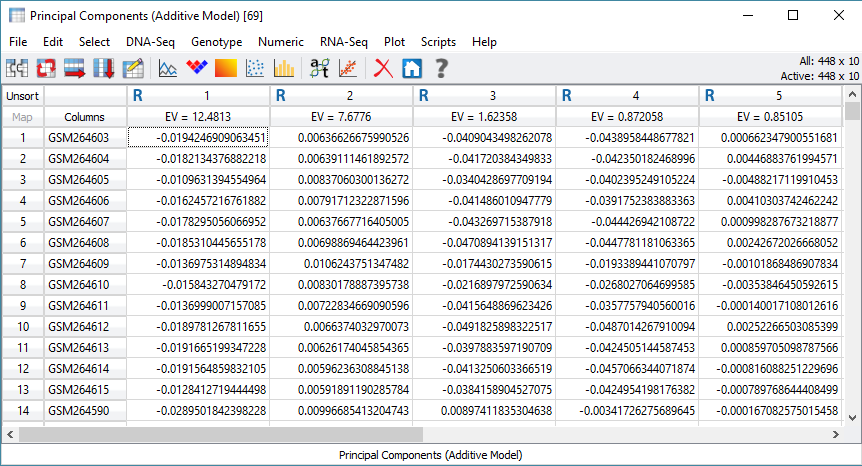
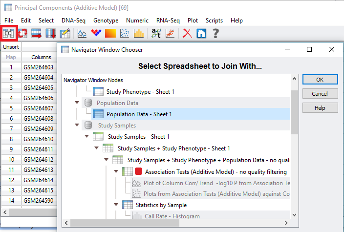
The results will include a list of Eigenvalues for each sample to be included in the association test (Figure 3). One additional step that can help clarify results is to merge phenotypic or population data to the PCA results. From the PCA output, click the merge spreadsheet icon located in the top left corner of the spreadsheet, and select the desired data to merge with the Eigenvalues (Figure 4).

Fig 3. Output of multiple Eigenvalues for each sample in the cohort.

Fig 4. Selecting population data to merge with PCA results.
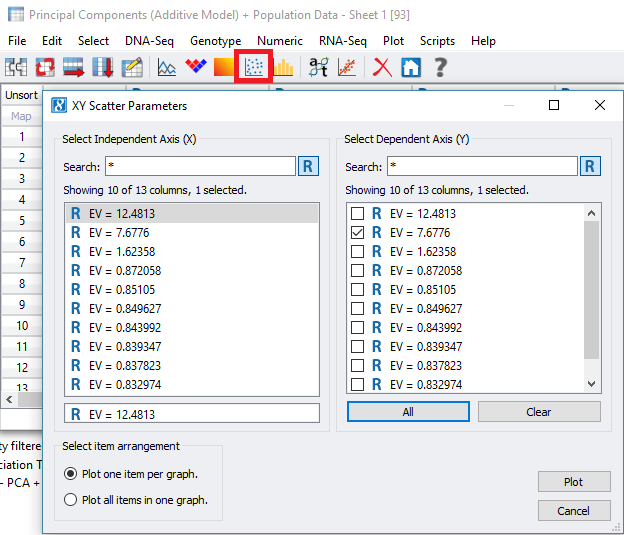
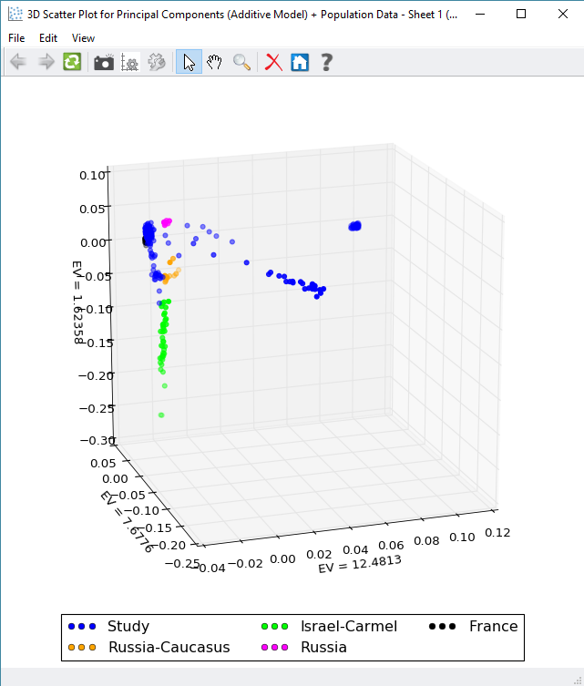
Once the PCA results are merged with the population data, the next step would be to create a scatter plot of the Eigenvalues to get a quick sense of possible clustering of samples (Figure 5). Once the plot is created, the samples can be colored by any variable column merged with the PCA results with Figure 6 showing the grouping by the added population column. Plotting isn’t limited to just two dimensions either, with SVS you can also generate 3D scatter plots to add more analysis depth and plots to your publication.

Fig 5. Creating scatter plots on Eigenvalues from the merged PCA and Population data spreadsheet.

Fig 6. Scatter plot data of two selected Eigenvalues colored by population variable.

Part V of this blog presents a fresh association test run using samples and markers filtered for quality control, but also instruction on how to implement PCA results into the association test. Check out our final blog of this series that best demonstrates the ideal GWAS results you should expect to see when utilizing SVS quality control and quality assurance capabilities. If you have any questions regarding the methods mentioned in this blog or previous blogs, please reach us at [email protected]
- Laurie C.C., et al. Quality Control and Quality Assurance in Genotypic Data for Genome-Wide Association Studies. 2010. Genetic Epidemiology 34: 591-602


