A helpful tool that is included in SVS, but many of our customers may not know about, is the ability to create Box Plots or box-and-whisker plots. These are effective visualizations for comparing groups of numerical data through the data quartiles. I’ll take you through a couple different cases with examples.
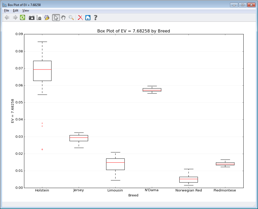
The first case we will look at is creating a box plot based on a category. Below is a plot created using data from the Bovine HapMap Project. There are many breeds in the dataset and after running a Principle Components Analysis it is helpful for researchers to see how the values compare between the different breeds or groups in the dataset. This plot is easily created by merging the phenotypic data spreadsheet with the output from PCA Analysis. Then go to Plot > Side-by-Side Box Plot by Category, simply select the categorical column and numeric column to plot. The graph can be edited by adjusting the x and y axis labels and y-axis maximum value. The title of the graph can also be renamed under the Edit Menu from the graph plot. There are also zoom options and of course all graphs can be saved as an image.

Another case for box plots is comparing sample data. During RNASeq analysis it is a good idea to look at the data distribution, which can be done utilizing box plots. Comparing the original raw counts data and the data after normalization can confirm the data distribution is normalized for all samples and you can proceed with further statistics/analyses. To generate these plots under the Plot menu click on Columnwise Side-by-Side Box Plots. The images below were created using the Breast Cancer RNASeq Dataset from our online tutorial.
The original count data has a large number of outliers (indicated as red crosses) and the actual boxes are barely visible at the bottom of the graph. Compared to the normalized data where there are fewer outliers and the boxes are visible.


Box plots are simple visualizations that are powerful to convey variation in data without making any assumptions about the underlying statistical distribution. At Golden Helix, we try to make visualizations as dynamic as possible by offering numerous options that can be molded to your research needs.


